Thursday, May 11, 2017

Final Project

Goals and Background
Throughout the semester I have learned many GIS techniques within lecture and by completing tutorials and labs to the best of my ability.  The information I have retained has been crucial in the completion of my final project.  This includes knowledge I have gained about setting up file geodatabases, queries, making new feature classes, coordinate systems, geoprocessing tools, and python scripting.  The goal of this project was to evaluate the GIS skills I have learned throughout this course to solve a spatial question of my choosing.  The question that I chose to assess went as follows: "Is there a potential correlation between the concentrations of diesel particulate matter (PM) in proximity to main interstates within the Central Valley and is this relationship connected to the rate of asthma emergency department visits among California residents?"  Additional objectives include using a minimum of three different spatial layers and four tools and further create maps and a data flow model that display the analysis of my spatial question.

Methods
To begin my protect, I searched for data that was relevant to my data; ArcGIS online provided the most relevant and useful data that I could find.  I added the layers I needed from both the US geodatabase used in the Price tutorials and from ArcGIS online.  I then set the projection of each layer to the UTM Zone 11N because it was the best fit for the Central Valley of California.  I then made queries to select areas within California and my area of study and made feature data layers so that the data was more manageable.  I also used the 'Clip' tool to constrain interstates and counties to the Central Valley.
For my study, I only needed the area within the Central Valley so county borders were irrelevant to me.  Therefore, I used the 'Buffer' tool on my clipped counties to get rid of the internal boundaries.  This created the layer 'CentralValley_el_inter_dissolve'.
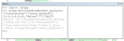
I then created a Multiple Ring Buffer around my interstates to see if the highest diesel concentrations were within this area and whether it had a proximity of 0 to 5 miles within the interstate or 5 to 10 miles within the interstate.  I did this by using a python script (Figure 1).
Figure 1. Python script used to create Multiple Ring Buffer for interstates.
I used a total distance of 10 miles because although diesel particulate matter of 2.5 in size can travel hundreds of miles, it seemed more reasonable to use a distance that seemed fairly close to the source that I hypothesized the diesel PM was coming from (pima.gov).
By adding a layer that contained diesel PM concentrations and using the 'Intersect' tool, I intersected the layer of diesel PM with my clipped buffered interstates to create the layer 'Diesel_interstates_intersect'.
Lastly, I added a layer containing asthma emergency department visit rates within counties in California.  I intersected this data with the diesel PM/interstate buffer that I intersected previously.  This would allow me to see if higher asthma rates were within the 10 miles and the concentrated areas of Diesel PM.  The steps I followed throughout the process of analyzing my spatial question can be seen in the data flow model below (Figure 2).  Finalizing my methods, I created a cartographically pleasing map to show the results of my research.
Figure 2. Data flow model of the steps I took to accomplish my final project.
Results
My project resulted in some interesting data yet more research probably needs to be done to fully understand such a complex topic.  I found that most areas with a high concentration of diesel PM follow a similar pattern to that of the interstates.  These areas are also within the 10 miles road buffer I made and those with the largest concentrations appear to be within the closest road buffer having a proximity of 5 miles to an interstate.  When looking at the asthma data in comparison to concentrations, it appears to be less conclusive.  This may be because these values are taken from counties and each of these counties do not fully lie within the Central Valley.  However, some of the highest rates of asthma emergency department visits correlate with the areas of high diesel PM concentrations – based on towns with high diesel PM concentrations within these counties.  I plotted the towns that were within the 90 to 100 percentile diesel PM scores to show that they were within counties with the highest rates of asthma emergency department visits.
Figure 3. Locator map for the Central Valley of California.
Figure 4. Concentrations of diesel PM that are within 10 miles of interstates within the Central Valley.
Figure 5. Rates of asthma emergency department visits within the 10 mile buffer of interstates in the Central Valley.


Sources
Esri2017 Database (2017). [downloaded file (Asthma ED Visit Rates by County 2012)]. SQL Server. URL: geogsql.uwec.edu [May 11, 2017].
Esri2014 Database (2014). [downloaded file (CalEnviroScreen 2.0 Diesel PM Score)]. SQL Server. URL: geogsql.uwec.edu [May 11, 2017].
Esri2010 Database (2010). [downloaded file (Hypsographic map of California)]. SQL Server. URL: geogsql.uwec.edu [May 11, 2017].
What is Particulate Matter? (n.d.). Retrieved May 11, 2017, from http://dylosproducts.com/whispama.html
What is Particulate Matter? (n.d.). Retrieved May 11, 2017, from http://webcms.pima.gov/


Tuesday, May 2, 2017

GIS 1 Lab 5


Goals and Background:
In order to complete Lab 5, I needed a well-structured background on map overlay and geoprocessing to perform the correct relationships between layers.  To attain the knowledge I would need to accomplish this, my professor established interactive examples that examined functions/tools such as clip, erase, dissolve, intersect, and union.  I also completed tutorials that emphasized these points as well as walked me through the processes in making dataflow models.  The goal of Lab 5 was to demonstrate my understanding of geoprocessing tools and dataflow models to examine suitable bear habitats in Marquette County, Michigan and explore the basics of python scripting by analyzing the development of tourist resorts in Wisconsin and air pollution zones near interstates in Wisconsin.  As a result of completing this lab, a map of Marquette County, MI and two maps of Wisconsin displaying their respective goals along with dataflow models of each part of the lab will highlight my awareness of geoprocessing tools in ArcGIS.
Methods:
I began this lab by unzipping the supplied files and exploring each file type and coordinate system.  Moving on, I found I was given minimal data for bear_locations.  In order to determine the relationship between this feature class and the land cover type, I used the 'intersect' tool to develop a new feature class called 'bear_cover' that gave me the land cover information I needed to proceed.  With new criteria given to me pertaining to river resources for bears, I used a 'buffer' tool to create a distance of 500 meters surrounding a stream.  To clean this data up, I also performed the use of the 'dissolve' and 'clip' tools.  Once I selected the appropriate land covers (Mixed Forest Land, Forested Wetlands, and Evergreen Forest Land), I used the 'intersect' tool to intersect appropriate land covers and distances within rivers to find the ultimate suitable bear habitat.
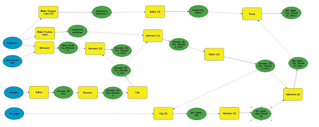
I was then given more criteria disclosing DNR management lands and that these restoration areas should exclude areas within 5 kilometers of Urban or Built-up lands.  Therefore, I performed clipping and dissolving on DNR management lands to analyze those within the area of study.  I also performed a buffer and used the 'erase' tool to exclude within the areas mentioned previously.  Each tool used within this part of the lab can be found in the data flow model below (Figure 1).


Figure 1. Data flow model for criteria pertaining to suitable bear habitats and DNR management areas.
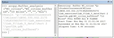
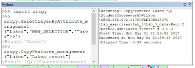
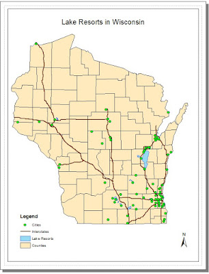
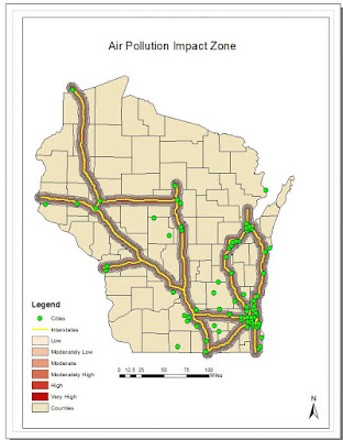
In part two of the lab I performed the python scripts shown below and developed more data models that explain each tool I used in the process of developing my final maps/analysis. Figure 2 through 5 illustrate lake resorts in WI (Section 1) and figures 6 and 7 display air pollution impact zones in WI (Section 2).

Figure 2. Python script for 10 mile buffer of cities in Wisconsin.
Figure 3. Python script for lakes with an area greater than 5 square miles.
Figure 4. Python script for clipping lakes that met criteria and buffered cities.
Figure 5. Dataflow model to develop suitable areas for the development of tourist resorts in Wisconsin.
Figure 6. Python script for making a multiple ring buffer around interstates in Wisconsin.
Figure 7. Dataflow modeling air pollution impact zones around interstates in Wisconsin.
Results:
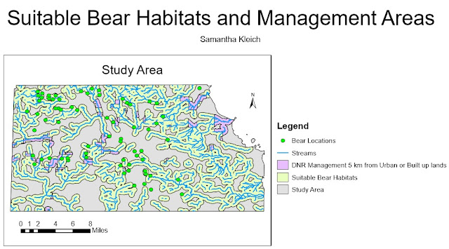
Using the methods I performed above, I created three maps: one of suitable bear habitats in Marquette County in Michigan, one of possible lake resorts in Wisconsin, and one of air pollution hazards near interstates in Wisconsin.  Each of these maps are shown below.


Figure 8. Map of suitable bear habitats in Marquette County, Michigan.
Figure 9. Map of suitable lake areas for the development of tourist resorts.
Figure 10. Map of air pollution impact zones near Wisconsin interstates.


Sources:
Esri2017 Database (2017) [downloaded file]. SQL Server. URL: geogsql.uwec.edu [May 2, 2017]

Michigan Department of Natural Resources (2017) [downloaded file]. SQL Server. URL: geogsql.uwec.edu [May 2, 2017]


Price, Maribeth. 2016. Mastering ArcGIS. 7th Edition data. McGraw Hill. [downloaded file]. SQL Server. URL: geogsql.uwec.edu [May 2, 2017]


Wilson, Cyril 2012, A comprehensive Lake features for Wisconsin, Unpublished data. [downloaded file]. SQL Server. URL: geogsql.uwec.edu [May 2, 2017]


Saturday, April 1, 2017

GIS 1 Lab 4

Goals and Background:
To begin this lab, it was important that I had a good understanding of query expressions. To do this, I started with simple queries and progressed towards more complex queries involving attribute and spatial selections during tutorials and lecture. The goal of this lab was to test my comprehension of query expressions to extract specific data from a database.  The data I was asked to extract in part one included detailed components of county data in the U.S. and in part two I needed to select specific cities and rivers in Wisconsin that met the criteria given in the statements.  At the end of this lab, my results included three U.S. maps and two Wisconsin map that each met their defined criteria given by each question.
Methods:
To complete this lab, I began by adding the counties layer from the U.S. geodatabase to my data frame. To answer question one, key terms such as 'between', 'also', and 'at least' hinted that I needed to use Boolean operators 'AND', 'OR', and the greater than or equal to symbol respectively (Figure 1).
Figure 1. Query for counties with population between 3000 and 4000 people in 2010 and also all counties in 2010 that had a population density of at least 1000 persons per square mile
In question two, I had to find records for counties again; I used the 'IN' expression and parenthesis to select multiple states at one time. Once the states were selected I used the Boolean expression 'AND' to select counties that met all the criteria. If I would have used the expression 'OR' results would also include states that only met one of the criteria mentioned and not both (Figure 2).
Figure 2. Query for counties in Wisconsin, Texas, New York, Minnesota, and California where the male population is greater than female population and also for these states the number of seniors (age 65 and above) is over 6500
As I continued to question three, I was asked to modify the query for question two. I used the Boolean expression 'OR' because I wanted results for both question two and question three. I used 'IN' again to select multiple states and the expression 'AND' to include housing units (Figure 3).
Figure 3. Query additionally added to that for question two including all other seniors in Washington, Maryland, Illinois, Nebraska, District of Columbia, and Michigan who reside in counties that have more than 30,000 housing units
For part two, I unzipped the file and continued with similar steps and included a spatial query. To do this I used WI_cities as my target layer, Lakes as my source layer, and specified within 2 miles.
Figure 4. Query for cities in Wisconsin with population in 2007 between 15,000 and 20,000 people, at least 5 square miles in land area, female population is greater than males, and also the cities are within 2 miles of a lake
Lastly, I made new map and started my final query for rivers in Wisconsin.  I made a field and used the Calculate Geometry to measure the distance for each entry.  Then I specifically selected the rivers listed by making the query shown below (Figure 5).  Once this was done, I used the Sum feature for the selected features in my MILE_FIELD entry to calculate the total length of the rivers.
Figure 5. Query to use to calculate the total length of these rivers in Wisconsin: Chippewa River, Eau Claire River, Embarrass River, Fisher River, Hunting River, Kinnickinnic River, Maunesha River, Milwaukee River, Moose River, Namekagon River, Pelican River, Platte River, and Potato River
Results:
I made five maps each displaying the selected features based off the criteria given for each question.

Figure 6 displays counties with population between 3000 and 4000 people in 2010 as well as counties in 2010 that had a population density of at least 1000 persons per square mile
Figure 7 displays counties in Wisconsin, Texas, New York, Minnesota, and California where the male population is greater than female population and the number of seniors (age 65 and above) is over 6500
Figure 8 displays all other seniors in Washington, Maryland, Illinois, Nebraska, District of Columbia, and Michigan who reside in counties that have more than 30,000 housing units in addition to those in Figure 7

Figure 9 displays cities in Wisconsin with population in 2007 between 15,000 and 20,000 people, at least 5 square miles in land area, female population is greater than males, and are within 2 miles of a lake

Figure 10 displays selected rivers in Wisconsin: Chippewa River, Eau Claire River, Embarrass River, Fisher River, Hunting River, Kinnickinnic River, Maunesha River, Milwaukee River, Moose River, Namekagon River, Pelican River, Platte River, and Potato River
Sources:
Price Mastering ArcGIS Database (2016) [downloaded file] SQL Server. URL. geogsql.uwec.edu [February 16, 2017].

Wednesday, March 8, 2017

GIS 1 Lab 3


Goals and Background:
Before beginning this lab, I had accomplished previous tutorials that taught me important information that pertained to this lab as well as crucial information I would need in my later career.  Prior to completing this lab, I studied new knowledge from the last few tutorials.  These tutorials included types of attribute tables, database management systems, joining and relating tables, cardinality, static and dynamic maps, and how to make a cartographically pleasing map.  The goal of this lab was to use my new found experience to evaluate GIS data and explore my critical thinking skills as I transformed and manipulated information from the United States Census Bureau for my own use.  As a result of completing this lab in full, my work should be portrayed by the creation of two static maps and one dynamic map.  Both of which involve processes I have learned thus far in the semester as well as new tasks I would need to overcome to achieve my goals.

Methods:
In order to complete this lab, I began by downloading and unzipping the 2010 SF1 100% Data from the United States Census Bureau into my personal Lab_3 folder.  At first I had trouble with the data set, but that was resolved when I was informed how to format data in my Excel Workbook data so that it could be used properly in ArcMap.  Once I overcame this minor struggle, I was able to join my shapefile attribute table and stand alone table together by using the GEO#id field ensuring a one-to-one cardinality.  Here I chose the field that the join would be based on and the table to join as well as the field in that table to base the join.  I had to be cautious during this step to assure I was joining my source to my destination and not vice versa.
Once all my data was correctly joined, I exported it as a new layer and chose the symbology of my choice to represent population size per county in Wisconsin.  I did this by suggesting a value and choosing a monochromatic graduated color so that the information was precise and could be clearly interpreted by my audience.  I then repeated this task for the data of my choice- Housing Units.  Finally I developed two cartographically pleasing maps.
My next step involved making a dynamic map which was fairly simple.  I signed into ArcGIS online, edited information in the Service Editor, published my map online.  Once this was done, I made slight changes to the Pop-up window and shared it with UW-Eau Claire-Geography and Anthropology.

Results:
Figure 1 displays the final map I constructed portraying the population size in each county in Wisconsin.  The darker color represents counties with a larger population and lighter shades are counties with less population.  From this, we can infer that south eastern Wisconsin contains the most populated counties.
Figure 1: Above is a map of population size per counties in Wisconsin.

Figure 2 shows the number of housing units in each county in Wisconsin.  Similar to that of the population map, the darker shades of orange are counties with more housing units and the lighter shades are those with fewer housing units.  Therefore, we can attain evidence that counties also in the south eastern part of Wisconsin contain the most housing units.  This seems logical considering the population in these counties.


Figure 2: Above is a map showing the number of housing units per county in Wisconsin.

Figure 3 displays the dynamic map I created from my housing map shown in Figure 2.  This map shows similar statistics but when using it online, it can be helpful for the viewer because of its interactive capabilities.


Figure 3: Shown above is a map displaying the number of housing units per county in Wisconsin using a dynamic map.

Sources:
United States Census Bureau (2010) [Download]. SQLServer.URL: factfinder2.census.gov/faces/nav/jsf/pages/index.xhtml [March 7, 2017].

Thursday, February 16, 2017

GIS 1 Lab 1

Goal and Background:
This lab was my first experience in testing my skills of geographic information systems based on the knowledge I gained from lectures and tutorials in my Mastering ArcGIS textbook.  The beginning skills I learned encompass information about coordinate systems, importing and exporting data, metadata, ArcCatalog, ArcToolbox, and projecting data.  All of these were useful as I developed my maps throughout Lab 1.  The goal of this lab was to evaluate my understanding of projected and geographic coordinate systems and manage unfit projections of GIS data.  I was asked to create six world maps and a map of Wisconsin based on predefined projections as well as a single map showing rivers and streams that flowed through the counties surrounding Eau Claire.  The ultimate goal for this lab was to use techniques I have acquired thus far to complete my final maps.

Methods:
I started this lab by downloading and unzipping the data I gathered from D2L.  I did this in order to access the data in ArcMap for my personal use.  I then began to add shapefiles to the dataframe in a blank map on ArcMap by using the Add Data tool. Once I added the shapefiles, I changed their symbols by double clicking on the symbol icon in the Table of Contents which pulled up the Symbol Selector tab where I chose different colors and styles.  To change the name of the data frame I slowly double clicked on the current name which allowed me to rename it.  After this, I right clicked on my new data frame name and chose Properties and then chose the  geographic coordinate system, WGS 1984.  I then continued to insert new data frames.  For each data frame, I renamed it, added the correct shapefiles, and changed the Projected Coordinate System.
Next, I inserted another data frame and added the shapefile, states.  However, this projected all of the United States rather than only the state of Wisconsin.  Therefore, I used the Select Features tool and created a layer that contained only Wisconsin.  From here, I used the data frame properties to once again change the data frame coordinate system; in this case, I chose NAD_1983_UTM_Zone_16N.
Then, I was asked to create another data frame with new shapefiles.  From here, I had to change the projection of the stroads_miv5.shp by using the Project tool in the ArcToolbox.  Finally, I switched to the layout view and began constructing a visually pleasing map that contained each of the seven maps I had just created.
After this, I started a blank new map and began by adding the shapefile containing central Wisconsin counties.  I used the Project tool again to change the projection of this shapefile.  I chose the geographic coordinate system, GCS_North_American_1983, based off the metadata and the projection system, NAD_1983_StatePlane_Wisconsin_Central_FIPS_4802,because theses counties are located within the central Wisconsin. I then repeated a similar process to this as I added the Lower_Chp_strms.shp shapefile.  I gave the streams the Projected Coordinate System NAD_1983_StatePlane_Wisconsin_Central_FIPS_4802 as well because this data is also located in central Wisconsin.

Results:
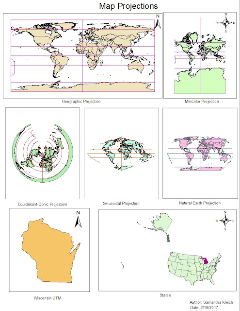
Figure 1 shows my final map containing various projections of the Earth including
Geographic, Mercator, Equidistant-Conic, Sinusoidal, and Natural Earth.  The figure also contains a UTM projection of Wisconsin and a Lambert Conformal Conic projection of the United States.  The solid color represents either countries or states depending on each of the seven maps and the lines on six of the maps show the geogrid.


Figure 1: Above is the final maps of six world maps and a Wisconsin map that demonstrate my understanding of geographic and projected coordinate systems.

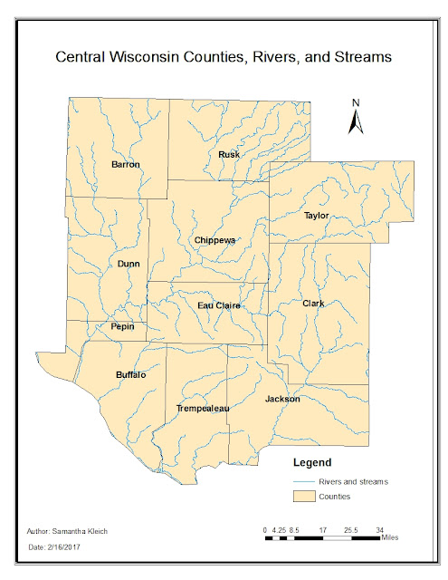
Figure 2 is a map I made that contains the counties of central Wisconsin that surround Eau Claire and the streams and rivers which run through these counties.  The beige color displays the counties and blue represent rivers and streams.


Figure 2: This is a map of central Wisconsin counties and rivers and streams which run through these counties.

Sources:
Michigan Department of Transportation (2017) [downloaded file]. SQL Server. URL: geogsql.uwec.edu [February 16, 2017]
Price Mastering ArcGIS Database (2016) [downloaded file] SQL Server. URL. geogsql.uwec.edu [February 16, 2017].